Q: Is the process of optimizing a website for mobile different from normal SEO?
A: Although, there are not major differences between optimizing a site for mobile and regular SEO, but mobile is a new thing so changes will flow with time.
One thing that you would notice is very different on the mobile is the user experience. In the desktop search, 10 results appear on the page, which shrinks to just 3 or 4 results in mobile. The two of which are the AdWords ads. So, it won’t be wrong to say that mobile favors AdWords ads for top SEO positions.
 Another problem that persists is that if someone has two websites – one for desktop and one for mobile, there are chances of Google getting confused as to what site is what. For example, inbound links vary with two platforms, so watch out for the issue. I would also recommend you to keep a check on duplicate content and link splitting issues.
Many of us think that since the website is already designed and set up, it would work on both desktop and small devices. This is one of the reasons due to which a good brand loses its visitors and traffic.
Sure, your website is responsive, and the same content is used on mobile devices, too; then what’s the issue?
Answer this, is desktop and mobile the same?
Evidently, mobile comes in handy and does every task that a computer would do. But when it comes to a website, the website’s content must be convenient, easy, and friendly for the users to access- whether the content display is on a desktop, tablet, or mobile device.
A website for the mobile version must be smooth, and when it comes to SEO, the mobile version demands so many SEO considerations such as usability, on-page tools, off-page tools, loading speed, and a lot of other factors your website might disappoint the user. Well, let us know the difference between Mobile SEO and desktop SEO.
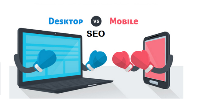
Mobile SEO vs. Desktop SEO
Well, mobile search engine optimization needs the same SEO practices as the desktop version, and yet there are few more advanced SEO variables required for mobile SEO. The mobile device won’t be able to afford the same screen size as the desktop, and neither the operating system would be helpful.
Hence, it takes different analytics levels, which will impact your content more effectively and help with ranking top on the search engine. Mobile SEO is flexible, and the framework succeeds on different devices too.
- SERPs- Search Engine Result Pages
When it comes to SERPs, the layout of both mobile and desktop versions differs. Obviously, mobile screens are way too smaller than desktop screens- and this makes Google uncomfortable managing multiple columns at the same time. However, it means that everything on the right side of the desktop will be displayed above or below when you do the mobile SEO. This works exceptionally well when you opt for organic results instead of paid listings and ads.
With a desktop, you can see multiple listings and results at a time, and hence it makes it easier to scroll through the pages. When it comes to mobile devices, the search result pages can be less but beneficial if Mobile SEO is done right!
- Click-Through Rates
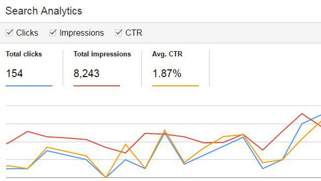
The website’s performance rate depends on how well you can do the SEO on your desktop or mobile devices. Remember that the CTR- also known as the click-through rate of mobile drops more quickly than that of desktop’s click-through rates depending upon the SEO impact of CTR. The CTR position keeps dropping, while when it comes to mobile, the CTR position is around 24% and keeps falling until its 5% to go on the top position. However, too many photos on the content can make the CTR drop, but it can also increase the traffic.
When it comes to desktop and big screens, the search results get more space and help to have multiple effects simultaneously. However, the desktop view also allows the users to see the most relevant and sponsored ads, enabling the website to cover-up enough traffic overall.
- Search Layout
Yes, there are quite differences in desktop and mobile screens when it comes to search layouts. Since mobile devices are vertical enough and provide a fraction of results than that of a desktop. However, both mobile and desktop displays are beneficial enough, but one needs to do at least the basic SEO perfect for each device. Google carries out the search results and layouts differently for both desktops and mobiles- optimizing the content enough. Sometimes, pictures and photos can take up more room, displaying fewer results than desktop.
Viewing the content on more giant screens like a desktop can offer an infinite variety of available features on mobile devices. However, it depends on the web owner on what primary content wants to be displayed on the mobile screens. If you don’t do the Mobile SEO properly, you are more likely to push organic results down towards the page- which could be drastic for your website.
Why do Google Search Results differ in Mobile?
Well, that’s a good question! Of course, now you already know the difference between both desktop and mobile. Apparently, the website ranking results don’t change effectively, but the appearance does change- impacting the traffic, SERPs, and the trends.
- The primary reason is the experience of the users. Which is more convenient? Mobile phones, obviously! Since we need information and results fast, we opt for our handy devices and get it done.
- Search engines know that users want better and instant information, and it breaks down listings with more images, videos, and features that would attract views and traffic than imagined or expected.
- Content is crucial, but images can speak a lot better than words; hence Google helps with more visual content on mobile devices than on desktop. Yes, the desktop gives out both textual content and visual content.
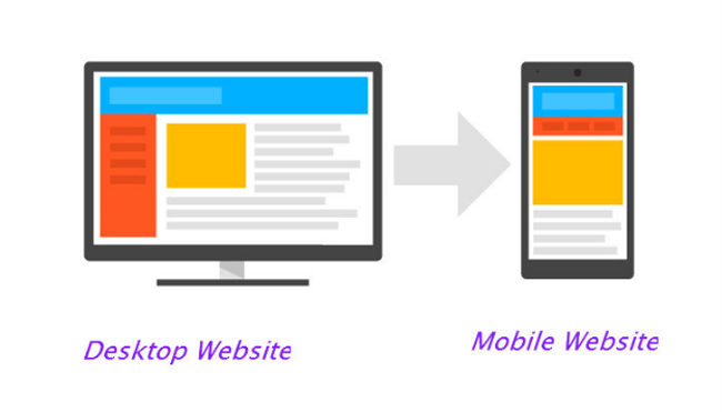
Mobile and Desktop SEO Strategies
You can now start preparing for SEO strategies suiting both the desktop and mobile. Does the strategy differ too? Not exactly, but to some extent! You can also combine the strategy and optimize the content or website accordingly. Here are some popular and expert-used SEO strategies that you can opt for.
- Local SEO must be done!
You can never ignore the importance of local SEO since they help you rank well on the internet, and eventually, you can target a broader audience according to the analytics and demographics. And, thoroughly, you can do the local SEO on both desktop and mobile by using the “near me” keywords on your content or the website. Optimizing the page and content with local SEO can boost your search engine’s rank and make it popular soon.
- Quick loading website
You are in a hurry, and you need information, imagine the website isn’t loading any faster; what would you do? The next level of frustration just hits us then! Remember, to make your website more valuable and clickable, you need to optimize the website and the content to be fast. You can trim down heavy images, videos that use more RAM, and the user’s internet speed. When you optimize for mobile SEO, you need to ensure that you are not maximizing the visual contents too much or compressing the image and videos according to the mobile devices.
- User-Friendly Design
Your website must always be evident, communicative, and transparent enough, whether you have created a desktop version or a mobile version. A user-friendly website or design is all about making a unique and highly responsive design when it comes to SEO strategy. What’s a responsive design? Responsive design is about adaptability and flexibility that forms in your website- ensuring the website or the content fits according to the device and its screen size. When you apply the responsive design with mobile SEO, it can double your benefits, and of course, the ranking picks up pretty faster.

- Keywords are the KEY!
Whether it’s desktop SEO or mobile SEO, you need to spend a reasonable amount of time understanding the user and research behavior. You need to identify the right keywords that are used in both desktop and mobile devices. However, voice search keywords can be more beneficial if you use them right on the mobile SEO, which helps target mobile users.
- Do not block JavaScript, CSS, or Images
To optimize the content and the website for mobile devices, many SEO experts or webmasters prefer to block the images, JavaScript and CSS, but it never works that way! Yes, there were times when mobile devices weren’t able to support these elements, but now the times have changed, and we use either android or iOS- which supports everything similar to a desktop. You need not hide these elements; just put them to use and optimize your content for higher ranking and traffic.
Conclusion
There are so many other factors that you must consider before optimizing your content, and the website for mobile SEO, but the ones mentioned above are the most significant ones that you can never ignore. You need to keep your users active by keeping up your website online and functional. You can use tools that would increase the efficiency of a website for both desktop and mobile. However, the users cannot keep up with single pages active for a long time; hence you need to give them choices. User-friendliness and stability of the website, according to Google, matters the most- since the faster the navigation, the better the ranking and traffic on search engines.


